Project Sidewalk — Final Product

Project Sidewalk

Scaling Civic Accessibility via a Zero-Defect Design System

Architecting a WCAG 2.2 AA compliant foundation to resolve technical debt and streamline pathfinding for 11,000+ users.

Read the study to learn how
a design system transformed civic tech
Lead Product Designer System Architecture 12 Months Civic Tech / Open-Source
Impact
0k+
Accessibility labels crowdsourced
0%
WCAG 2.2 AA compliance
0
Teams adopted the system
Team
1 Product Designer (me)
System Architecture Lead
3 Cross-functional partners
1 PM · 2 Developers
Timeline
12 Months
Civic Accessibility Platform
Domain
GovTech · Urban Accessibility
350k+
Labels Crowdsourced
WCAG AA
3 Teams
Adopted
11k+
Users Supported
~2 min read

Short on time?

Get the quick highlights in a visual, swipeable format.

Swipeable slides · 4 key insights · ESC to close
Context / Challenge

Growing Pains & Accessibility Debt

Project Sidewalk is an open-source civic platform that crowdsources urban accessibility data to train machine learning models. With over 350,000 labels collected, the platform had proven its value—but the internal architecture and user experience were brittle.

I identified three critical friction points holding the platform back:

Before
After
Inconsistent
4 different button styles
Non-compliant
37% contrast failure
Zero Defects
100% WCAG AA pass
User Drop-off
Inconsistent UI and unclear feedback structures caused high abandonment rates in core reporting flows for our 11,000+ volunteers.
Engineering Bottleneck
The absence of a centralized design system forced developers to rebuild UI components from scratch, leading to severe technical debt and frequent frontend regression bugs.
The Accessibility Irony
Despite being a tool for accessibility, the platform itself failed to meet basic WCAG standards, inadvertently alienating the very community it aimed to serve.
WCAG 2.2 AA Compliance Audit
Initial assessment across core pages · Illustrative
Pass Fail
Color Contrast 37% pass
Keyboard Navigation 42% pass
Screen Reader 28% pass
Focus Indicators 51% pass
Critical gaps identified — screen reader support was the weakest area
* Values are illustrative. Actual audit data is confidential.
Process

From Audit to Architecture

1. Data-Informed Diagnostics

Instead of relying on intuition, I audited the existing experience using both quantitative and qualitative data to prioritize high-impact interventions.

Behavioral Analysis
Reviewed Hotjar heatmaps and session recordings to pinpoint exact drop-off points, navigational friction, and hesitation markers.
Community Voice
Analyzed GitHub issues and user forum discussions to synthesize and prioritize recurring usability pain points.
WCAG 2.2 AA Audit
Conducted a rigorous heuristic evaluation of the legacy interface against WCAG standards (e.g., color contrast, keyboard navigation, screen reader support).
sidewalks.umd.edu/label
Heatmap
Clicks
Scroll
247 clicks
183 clicks
100% saw this
78% scrolled here
54% reached
31% reached
68% of clicks here
Users concentrated on map center — struggled to discover labels outside the current viewport.
42% drop-off
Users abandoned sidebar label controls after first attempt. Navigation was unclear.
Highest engagement
Validation buttons had strongest click-through — users understood the core labeling task.
Low
High
Click the pulsing dots to explore findings
Recreated visualization — actual Hotjar data is confidential. Patterns and proportions reflect real findings.

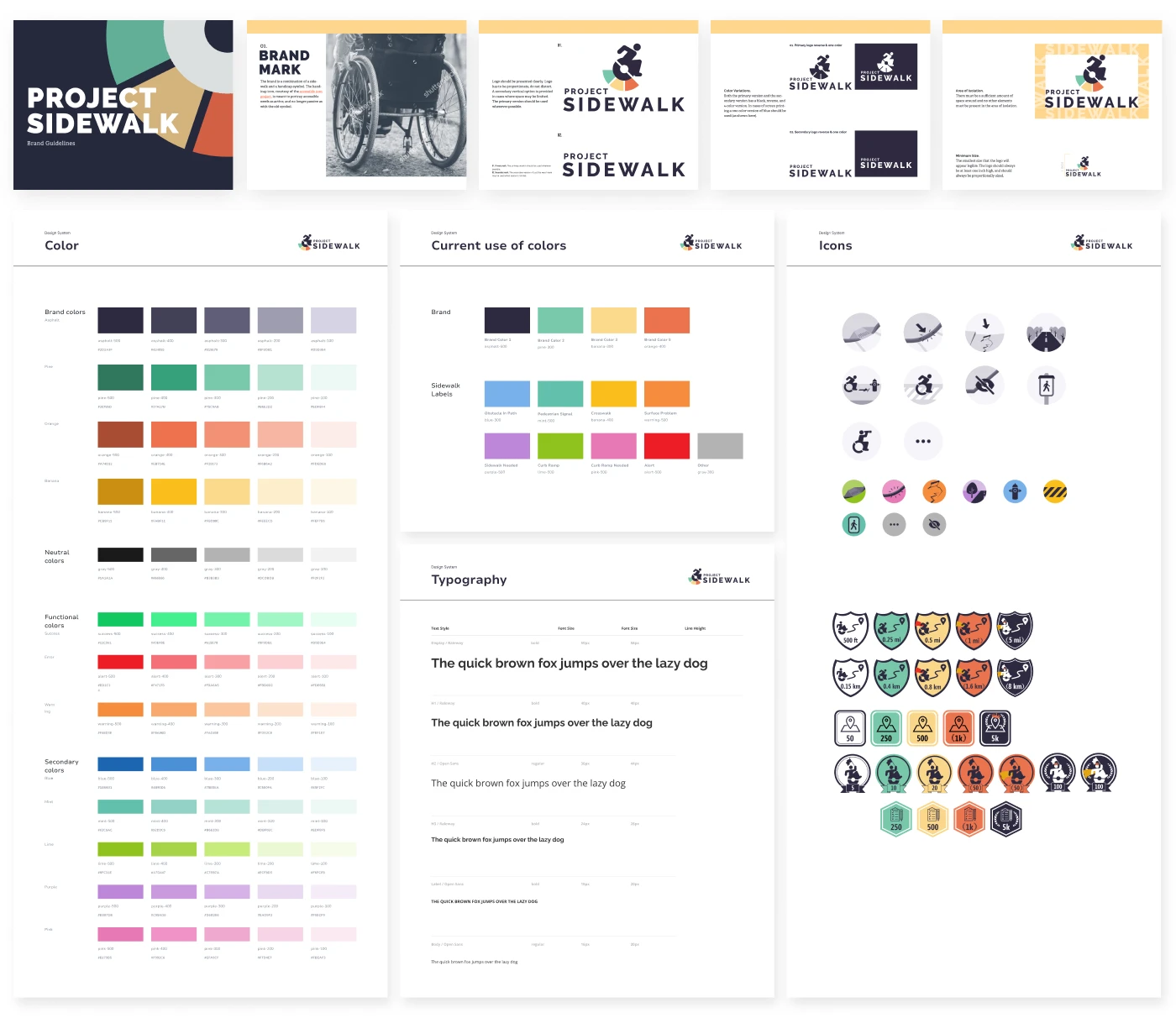
2. Architecting the System (The “Zero-Defect” Standard)

My goal was to shift from delivering polished screens to building resilient infrastructure that enabled sustainable growth.

Click each card to learn more
Approach
Tokenization & Semantics
Defined atomic design tokens to establish a “Single Source of Truth” between design and code.
click to flip
Detail
Design ↔ SCSS Parity
I mapped Figma variables 1:1 with the engineers’ SCSS variables, eliminating guesswork and friction during handoff.
click to flip back
Approach
Accessible by Default
Built a comprehensive, reusable component library with WCAG 2.2 AA compliance baked into its foundation.
click to flip
Detail
Compliance Built In
Any future feature built with these components would inherently meet accessibility standards—eliminating the need for retroactive WCAG fixes.
click to flip back
Design Token Mapping
Design Tokens
color.primary
color.text
spacing.md = 16px
SCSS Variables
$color-primary: #16a34a;
$color-text: #1a1a1a;
$spacing-md: 16px;
1:1 parity between design and code — single source of truth

3. Scaling & Cross-Functional Adoption

A design system is only as successful as its adoption rate. Working tightly alongside 1 PM and 2 developers, I treated the system not as static documentation, but as a working contract between design and engineering. Through phased rollouts, comprehensive spec handoffs, and collaborative alignment, I championed the system's integration across the broader organization.

Redesigned Map Interface — Optimized Pathfinding
Core Design Principle
Treat design as infrastructure, not surface. Build systems that make compliance automatic and scaling effortless.
Design System

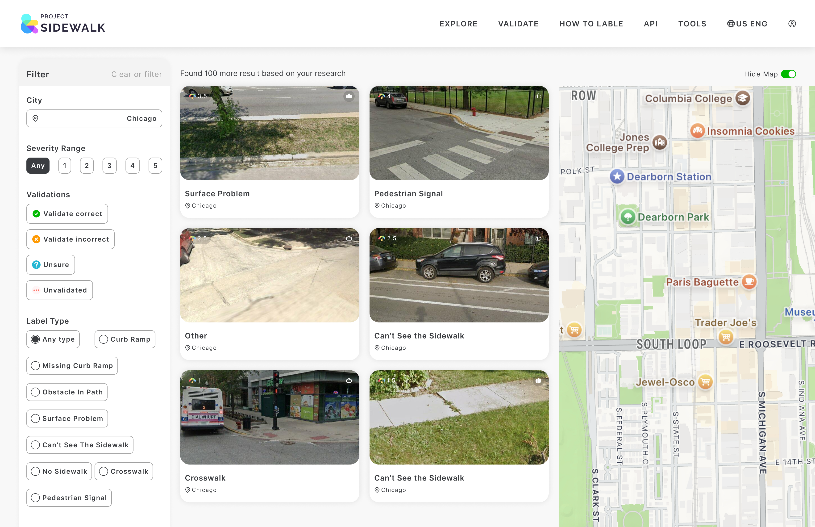
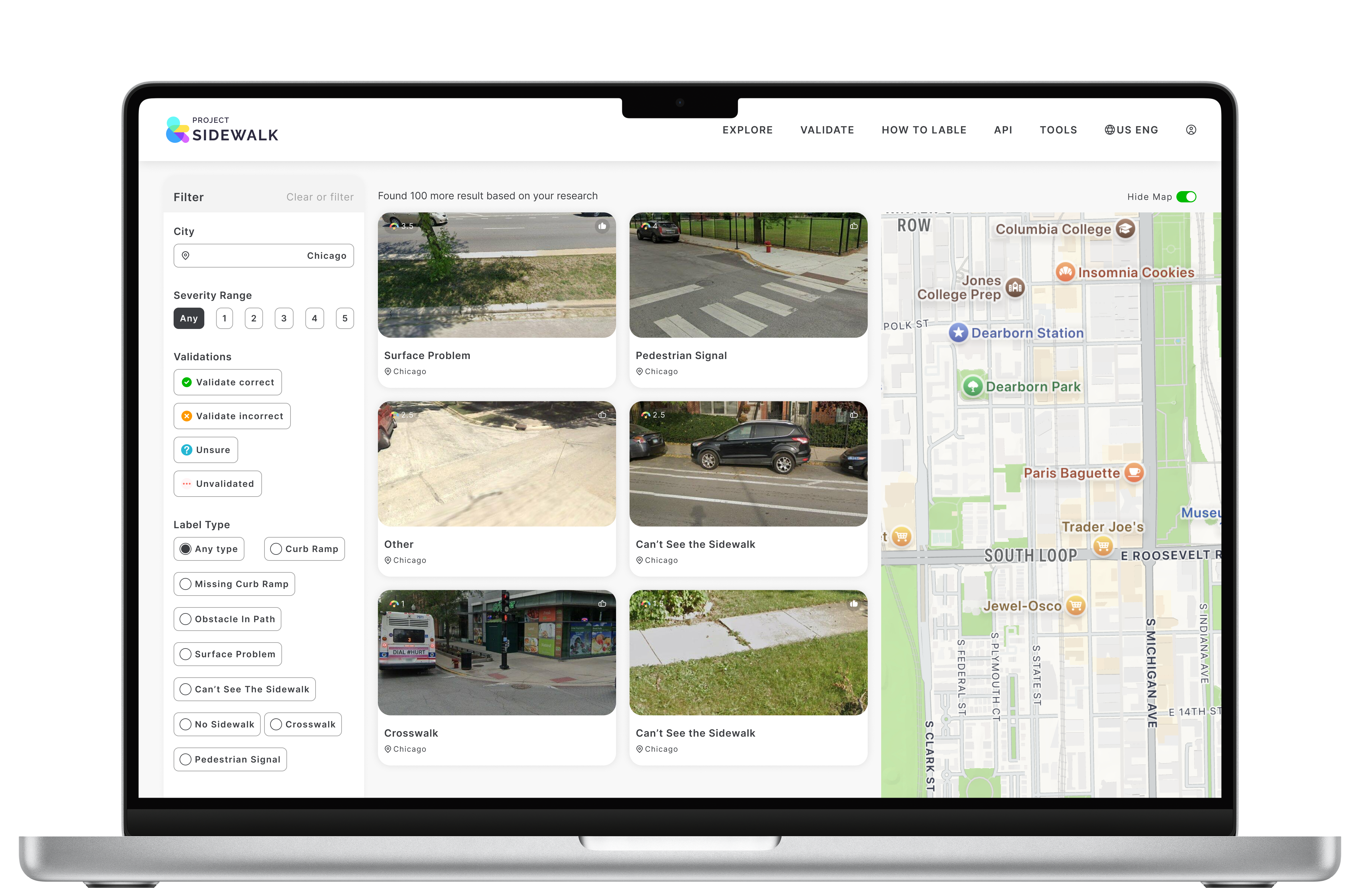
Before vs. After: The System in Action

The design system wasn't just documentation—it was a working contract between design and engineering. Here's how it transformed the development workflow.

Before — Fragmented
Incorrect
Correct
Not sure
skip
Mixed shapes, sizes & naming
No semantic token mapping
Label colors varied per page
After — Systematic
Validated incorrect
Validated correct
Unvalidated
Unsure
Validation button system — 4 states, 2 sizes
asphalt
pine
banana
orange
9 semantic label tokens + 4 brand primitives
What the system solved
Before — Ad Hoc
Components rebuilt from scratch
wasted effort
WCAG checked manually per page
error-prone
Inconsistent handoff specs
slow cycles
After — Design System
Reusable component library
Accessibility baked into every component
Token-based specs — zero ambiguity
Component Library Preview
All components built with WCAG 2.2 AA compliance · Accessible by default
Button
4:5:1 contrast ratio
Search...
Keyboard accessible
Accessible
Screen reader labels
Full Component Library — Design System Documentation
Outcome & Impact

Outcome & Impact

What began as a UI cleanup evolved into a strategic effort to scale a civic tool through thoughtful, resilient design.

11,000+ Users Supported
Clearer, more intuitive navigational flows significantly improved contributor task completion rates.
100% WCAG 2.2 AA Compliance
Eliminated legacy accessibility debt, validated by zero violations in automated axe-core audits.
Zero Defects & Faster Velocity
System adoption across 3 cross-functional teams drastically reduced engineering overhead, accelerated feature delivery, and eliminated UI-related frontend bugs.
wcag-audit — WCAG 2.2 AA
$ npx axe-core --standard wcag2aa ./components
Running accessibility audit on 24 components...
Color Contrast
0 violations · 4.5:1+ all text
Keyboard Flow
24/24 components reachable
Screen Reader
NVDA + VoiceOver verified
Focus Indicators
Visible on all interactive elements
ARIA Labels
All roles & landmarks defined
Touch Targets
44px minimum · spacing compliant
✓ 6 checks passed · 0 failed · 0 warnings
Completed in 2.4s · Standard: WCAG 2.2 AA · Tool: axe-core 4.8
Reflection

Systems Thinking in Civic Tech

A robust design system is not just a style guide—it is a tool for empowerment that allows developers to move faster and ensures that inclusivity is baked into the code, not just the pixels.
Designing for Resilience — This project shifted my perspective from designing for "the happy path" to designing for resilience in open-source and civic tech environments.
Infrastructure over Surface — By treating design as infrastructure, I enabled 3 cross-functional teams to ship accessible features without extra effort.

This project taught me that in civic tech, a design system isn't a luxury—it's a necessity for scale. When inclusivity is baked into the system architecture, every new feature inherits those values. The result is a platform where accessibility is automatic, not an afterthought.