Overview
Why We Built Lepal.ai
Existing wellness solutions offered productivity hacks but lacked emotional continuity. Our target users — Gen Z — needed empathy, not efficiency.
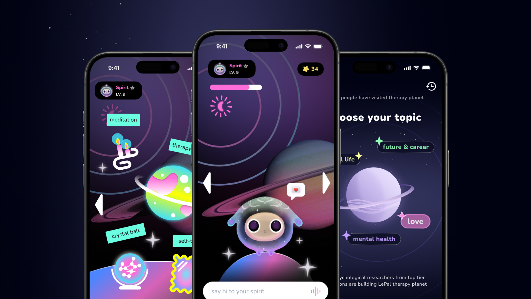
As Lead Designer, I owned the end-to-end design for 3 core experience pillars:
🧠
My Journal
A mood-aware journaling flow. Focus of this study
🔮
Crystal Ball
Daily micro-interaction offering reflective "fortune cookie" insights.
🌍
Therapy Planet
Topic-driven AI chat for deep dives into burnout or relationships.
While I designed the entire ecosystem, the biggest challenge lay in "My Journal," where we needed the AI to feel like a supportive companion, not a robot.
The Team
Me — Lead Product Designer
Design, Strategy, Tone Framework
Eng
x2
PM
x1
Conv. Designer
x1
CTO
x1
ML Eng
x1
My Role as the Bridge
Facilitated cross-functional alignment, reframed technical debates using user psychology, and built shared artifacts that gave every discipline ownership of the solution.
The "72-Hour Wall"
Despite a promising beta, data showed strong Day-1 interest but rapid disengagement around the 72-hour mark.
72-Hour Drop-off Timeline
Day 1 — Excited
"This is cool! I told it about my day and it actually responded nicely."
100% active
Day 2 — Lukewarm
"Hmm, it gave me the same kind of response as yesterday. Kinda generic."
68% active
Day 3 — The Wall ⚠
"I'm wiped after back-to-back labs. Zero energy."
AI Response (The Drop-off Trigger):
"Got it! Let's do a deep reflection with 5 questions to boost productivity!"
31% active — cliff
The Insight: When users expressed fatigue or vulnerability, the AI defaulted to a "productivity" framework. This empathy mismatch caused a 40% spike in session drop-offs. The issue wasn't app performance — it was the AI failing to "read the room."
Day 7 — Gone
User never returned.
14% active
The team was split on the root cause
Engineering
"It's a memory bug."
Backend wasn't persisting context, causing disjointed conversations.
Fix session persistence
VS
VS
Design (Me)
"It's an empathy gap."
The AI remembered facts but failed to read feelings. Users didn't feel heard.
Redesign tone & interactions
Research
Validating the Hypothesis
To find the "why," I conducted a mixed-method study: 5 semi-structured interviews with Gen Z graduate students and a 3-day mood diary study.
5
interviews (Gen Z grad students)
3
day mood diary study
800+
beta session logs reviewed
1,000+
user utterances coded from logs + interviews
The Insight
Users felt "unseen."
The AI was offering solutions when the user needed validation. A backend fix wasn't enough — we needed an emotional overhaul.
Research artifacts are under NDA and cannot be shown.
Strategy
Adaptive Tone Framework
I reframed the goal from "Fixing memory" to "Prioritizing empathy before solutions."
I collaborated with ML engineers and PM to build an Emotion-Aware AI Framework. Instead of one-size-fits-all, the system now intercepts user input to "read the room."
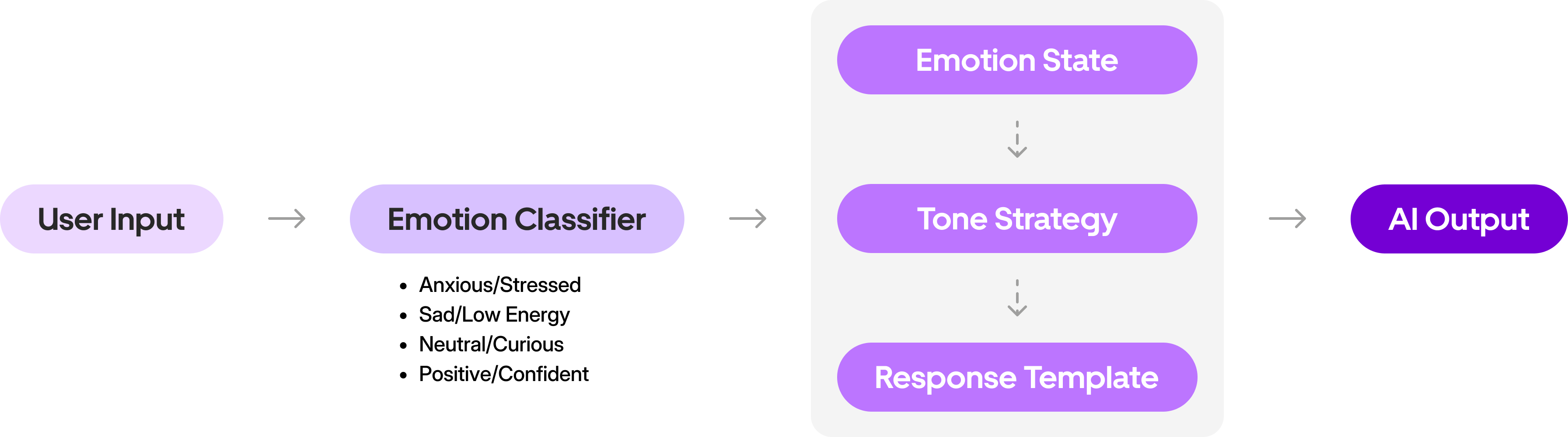
The Adaptive Tone Framework — how the system classifies emotion and adjusts responses
Try it — Type a sentence and watch the classifier work
Live Emotion Classifier
Try:
Input
...
Classified
...
Tone
...
Output
Adapted Response
😰
Anxious
Calm & Validating
Structure: Acknowledge → Tiny step → Soft close
Markers: Short sentences, minimal exclamations
AI Would Respond:
...
How It Works
Context Over Keywords
Rather than relying on basic keyword matching, I collaborated with ML engineers to map user inputs to 4 core emotional states using LLM-based context analysis.
Example
User types:
"Just got back from meeting my advisor."
Keyword-only approach
😐
Neutral
No negative keywords detected — defaults to generic tone.
LLM context analysis
😰
Anxious
Evaluates historical inputs (recent high anxiety) → responds with Calm & Validating tone.
😰
Anxious
Calm & Validating
😢
Sad
Warm & Gentle
😐
Neutral
Curious & Open
😊
Positive
Celebratory & Affirming
Design Execution
Designing "My Journal"
Once we established the Tone Framework, I had to translate that logic into the interface. I led the redesign of the "My Journal" screen, focusing on two pivotal decisions to make the AI feel less like a machine and more like a companion.
01
The "Thinking" Indicator
Authenticity
The Challenge
Even with an empathetic tone, the AI's instant responses felt robotic. We needed a visual cue that implied "processing" and "care," not just "loading."
The Trade-off
A
Generic Indicator
Clear system status, easy to build.
Too functional — feels like waiting for a server, not a friend.
Selected
B
Typing Dots
Mimics human behavior.
Feels like a companion is thinking about what you said.
The Outcome
I implemented animated typing dots with variable latency. This small visual shift changed the user's perception from "The app is downloading a reply" to "A companion is thinking about what I said," significantly boosting the feeling of authenticity.
1–1.5s
Light check-ins
1.5–2s
Moderate sharing
2–3s
Heavy emotional
Response Speed
1.5s — Thoughtful
Instant (robotic)
3s (deeply thoughtful)
I've been feeling really anxious lately...
Final Design
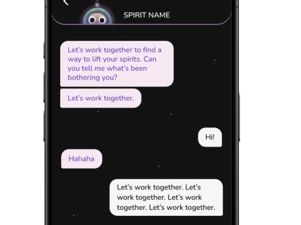
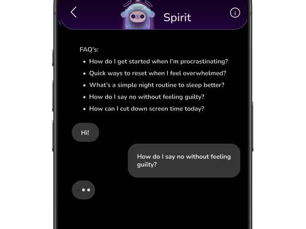
The “Blank Page” Dilemma
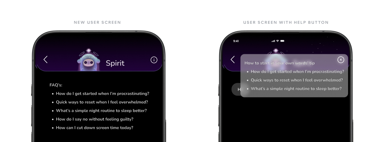
A second decision — the blank-page dilemma — followed the same logic: contextual starters for first-run users, fading out once journaling becomes self-directed, with an on-demand ⓘ for guidance. Retention protected, data quality intact.
Cross-Functional Collaboration
Turning Conflict into Co-Creation
The biggest challenge wasn't the pixels — it was aligning the team on why we were building this way.
Disagreement
Week 1
Research
Week 2–4
Shared Framework
Week 5–6
Co-building
Week 7–10
Launch
Week 12
01
The "Speed vs. Care" Debate
with Engineering
ENG
Lead Engineer
"You want us to add artificial latency?"
ME
Me (Designer)
"Latency isn't lag — it's listening."
"Variable Latency" shipped as a feature, not a bug
Usability Testing: Speed vs. Care
While intentional delay builds trust, excessive lag frustrates users. I established a maximum latency threshold of 3 seconds and ran a pre-launch comparison test.
Control
<100ms
Instant Reply
"Feeling heard" score
Winner
Variant
1.5–3s
Variable Latency
Significantly higher + zero "slow" complaints
02
The "Friction vs. Data" Trade-off
with PM
PM
Keep prompts
"Users will freeze and churn without guidance"
TENSION
ME
Remove prompts
"Button-mashing gives us garbage data"
The "Training Wheels" Compromise
🆕
New users
Starters ON
🔄
Returning
Starters OFF
🛟
Safety net
FAQ button
PM
Retention protected
ME
Data quality intact
The Shared Artifact
The Tone Framework became the team's shared language — a single artifact where every discipline had ownership of a piece. This is what turned conflict into co-creation.
Adaptive Tone Framework
Me (Design)
Tone rules, interaction patterns, latency UX
Engineering
Variable latency logic, context pipeline
PM
Success metrics, retention KPIs, A/B test design
Conv. Designer
Response templates, empathy markers, tone copy
What the team said
"I didn't see it as a UX problem until she reframed latency as listening. That changed how I thought about the entire architecture."
SE
Lead Engineer
Outcomes & Impact
From Productivity Tool to Emotional Companion
To validate the Tone Framework, we ran an A/B test comparing the original "Productivity-driven" tone (Control) against our new "Emotion-Aware" framework (Variant).
Control: Productivity-driven tone
vs
Variant: Emotion-Aware framework
85%
rated the AI “supportive”
post-test survey
+15%
D7 retention — sustained past the 72-hour wall
variant cohort
30% →
45%
Engagement
24% →
60%
Satisfaction
Final Mockups
Reflection
What I Learned
Good product design is about designing relationships.
Conflict → Collaboration — I aligned Engineering's need for "logic" with Design's need for "empathy" by building a shared Tone Framework they could both contribute to.
Rituals over Features — Success wasn't about adding more tools, but refining the daily ritual of journaling to be emotionally safe. A smaller, warmer feature set won over a larger, colder one.
This project taught me that the best AI products don't just process language — they understand context, respect emotion, and create space for human vulnerability.